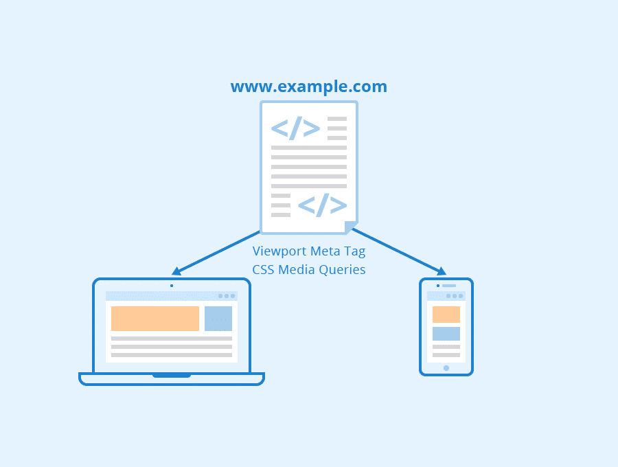
RWD uses so-called breakpoints to determine how the layout of a site will appear: one design is used above a breakpoint and another design is applied below that breakpoint. The breakpoints are commonly based on the width of the browser.
Visibility features provide the ease of Accessibility
Responsive design relies on proportion-based grids to rearrange content and design elements.
RWD has potential advantages over developing separate sites for different device types. The use of a single code base can make development faster, compared to developing 3 or 4 distinct sites, and makes maintenance easier over time, as one set of code and content needs to be updated rather than 3 or 4. RWD is also relatively “future-proof” in that it can support new breakpoints needed at any time. If a 5-inch device or 15-inch device takes off in the market, the code can support the new devices. RWD doesn’t tie design to a particular device.
Small business should switch to responsive business. This would eliminate the need for a different design and development phase for each new gadget on the market. Responsive sites use fluid grids. All page elements are sized by proportion, rather than pixels. So if you have three columns, you wouldn’t say exactly how wide each should be, but rather how wide they should be in relation to the other columns. Column 1 should take up half the page, column 2 should take up 30%, and column 3 should take up 20%, for instance.
The same HTML is served to all sizes maintaining functional parody, and CSS is used to determine the behavior of the layout as the screen width reduces. Elements are often not simply scaled, but reorganized to allow for a more efficient use of space. Larger navigation hierarchies might roll up into a hidden menu, boxed content might become a carousel and columns of content might become stacked into a single column view as a page shrinks.
The working of a single website for both desktops & mobile device make it more extensive instead of different sites as per devices chooses by users. Can you imagine your site working independently & adjusting?
Visibility features eventually provide the ease of accessibly acquired websites on all devices. These visibility will attract more traffic to your site that raises your income graph.
These features provide the ease of optimizes the site against one link. One URL optimizations are very easy that give consistency in URL structure against all devices
It is the most important feature of RWD Websites, Games Apps for budget conscious customers. Instead of developing different versions of a single site that will compatible against desktop, laptop, iPods and smart phones you just need to develop a single site with responsive characteristics.